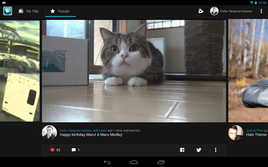
During the development of Telly we tried different ways to achieve those rounded avatars that for some reason had become the standard way of display an user’s avatar, I think there was a meeting last year and all the designers agreed that avatars had to be rounded :)
I tried three different approaches listed below, ranked in my opinion which is worst to better, having the best at the end:
The bad
This is an old one from the ages where you didn’t have border-radius in CSS, you simply can overlap an image with alpha in the region you want to display, and match the background color in the regions you want to hide, causing the illusion of cropping like this (warning: uglified on purpose):
Without using custom views your layout would look more or less like this:
Why is it the bad?
First if you look closely you could notice if you do a poor job with your resources you will get a pixelated border plus your solid colors won't even match depending on
Bitmapconfiguration
Second obvious overdraw is obvious, you get it even without adding states just yet

Again, this is resource error prone, if you are not careful enough you could get broken resources in different densities

Finally, by just changing your background you will have to update your overlays to match that color and forget about gradients, and remember you are not supporting states just yet.
 </li>
</li>
The ugly
So next we have a familiar one, it is widely used by several apps right now, this technique consist of using a second Bitmap for masking, whether is one obtained from resources or drawn at runtime, this technique provides much better results and you don’t have to deal with resources:
It produces a beautiful circle!
without overdraw or pixelation, yet keep reading…


Why is it the ugly?
To be fair it is not ugly, it is quite the opposite, isn’t it?, we should call it “the dirty” instead, you probably noticed we recycle the original Bitmap right away, the problem is also a well known, if we are using a lot of them we get good chances eventually we could run out of memory soon and get an OutOfMemoryException, it gets worst if we don’t properly cache those computed Bitmaps and our animations and scrolling could get janky due garbage collector claiming memory while we continue allocating for each avatar.
The good
Finally visually we can’t get any better than the one above, but regarding performance sure we can, do you remember this Android Recipe from Romain Guy?, well you bet it is about doing the same, after that we can get a nice drawable or view, that we can desaturate or apply some color filters and of course we can reuse like this one:
Note that both Views share the same Bitmap
So there you have it, the rule of thumb when using Bitmaps (and actually any other Object) is to use them as few as possible but use them to delight and enchant your users, if you didn’t get tired of seen my face so many times hopefully I will be publishing more recipes/tips like this if you like to subscribe to this blog, or add me on Google+, follow me on Twitter or GitHub! where I often post #androiddev fun :)


